As a child,
the best part of going into a candy store was merely
the senses overload that would happen the moment
one stepped foot into wonderland.
Your nose tingling with jelly belly flavors,
your eyes getting spasms from the visual overload,
and of course the salivation that happens after the first 2 sensations have set in.
RED Design takes a different spin on this sensory overload
with a simple design to help aid the grown-up in us
indulge in some childish pleasures.
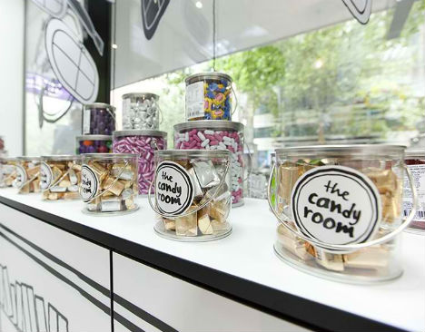
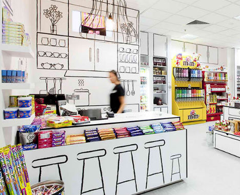
Black-and-White & sketchy.
The Candy Room is the classy and tasteful
for anyone 8-80.
for anyone 8-80.
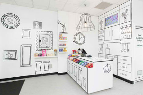
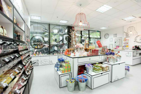
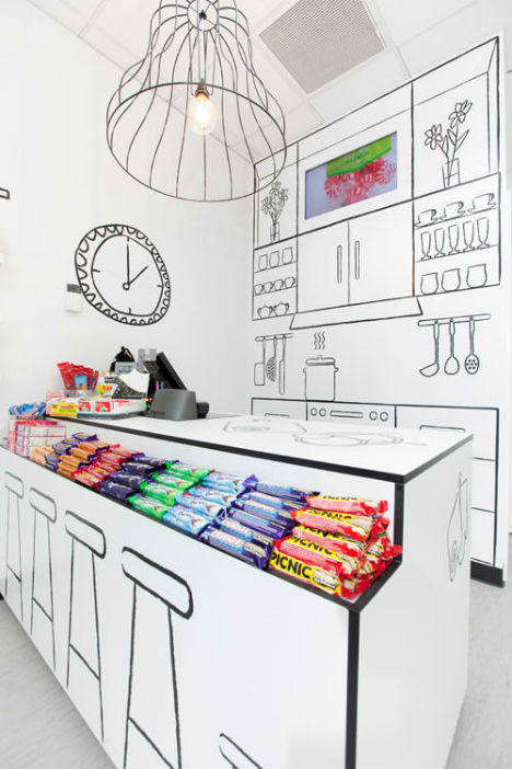
“Being strongly influenced by the idea of designing a playful,
simple and somewhat illusional space for the Candy Room,
the exaggeration of a ‘room’ idea was formulated,
The application was to use line artwork on white space to represent a room.”
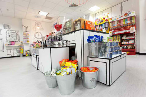
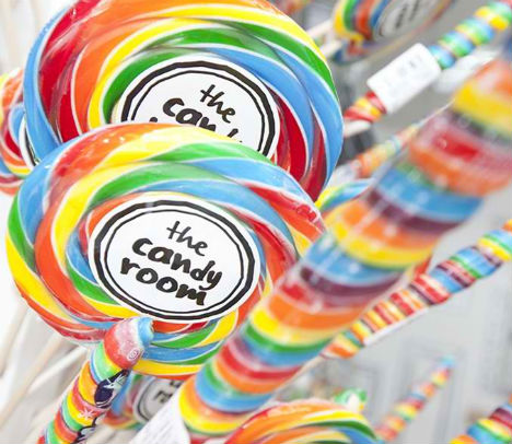
'The Candy Room' -- Melbourne,Australia
by: RED Design



0 comments:
Post a Comment